Population re-distributed!
Post by Sune Lehmann and Laura Alessandretti. Published: May 12, 2020.The lockdown presented a massive disruption to daily lives in Denmark.
As discussed in the Population Landscape post, we observed a massive decrease of the number of people in the central districts of cities and airports. We can see this quite clearly in the screenshot from the Landscape visualization, which shows Copenhagen during Easter.
But we can’t learn everything from beautiful pictures of single cities. One thing that this type of viz is not good at showing, is changes over time. To get at those changes, we want to construct measures which summarize the overall difference from a normal state-of-affairs. And then study this measure as it changes over time.
We have created two visualizations to study how “spread out” the population is – and how that changes over time. You can find the two visualizations and ask your own questions here. Below, we discuss some of our most important findings from these visualizations.
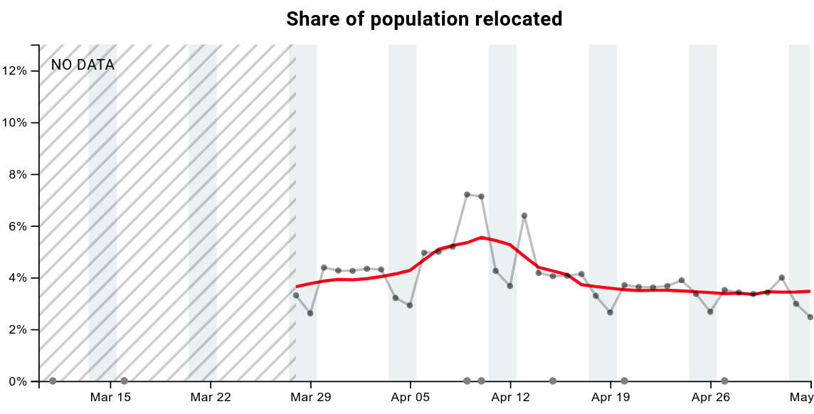
~4% of Danes are not where they were before lockdown
The share of population relocated (see Figure below) corresponds to the fraction of individuals that are to be found in a different area compared to before lockdown. At the end of March, that was the case for 4.4% of Danes. During Easter, the population relocated increased up to 7.2%, and then, by the end of April, its value has dropped down to approximately 3.4%.
Gini index
The Gini Index is a nerdy index, which measures how unevenly distributed (or concentrated) a distribution is and can, therefore, inform us about trends in how the population spreads out across the country. As we can see from the giant peaks of cities in the Population density maps visualization, the population is usually very unevenly distributed. We observe in the same map visualization that people spread out during the lockdown, distributing themselves more evenly throughout the country.
The Gini Index ranges from zero to one. If the population spreads out perfectly such that every tile contains the same number of people, the Gini Index will be zero. If all of Denmark concentrates in a single tile it will be one. You can explore the interactive version of the visualization here
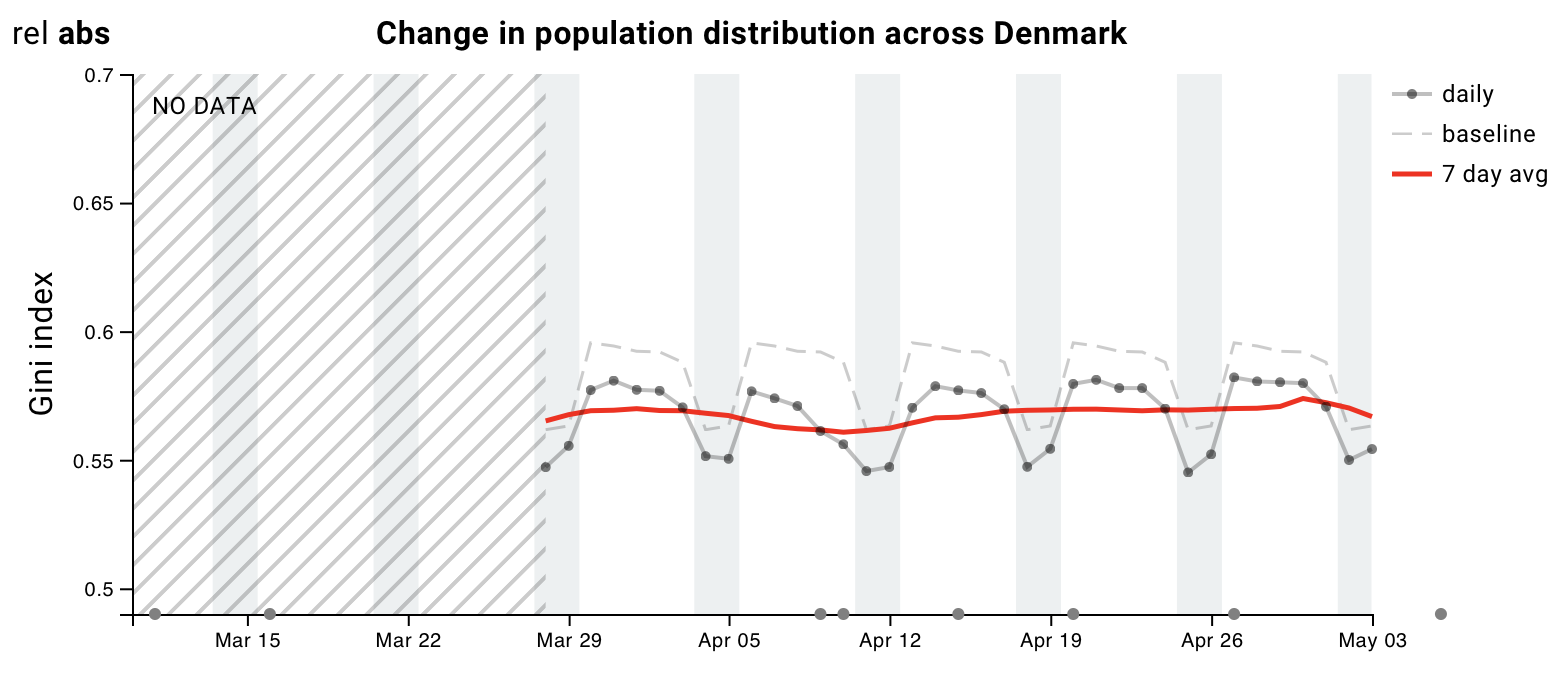
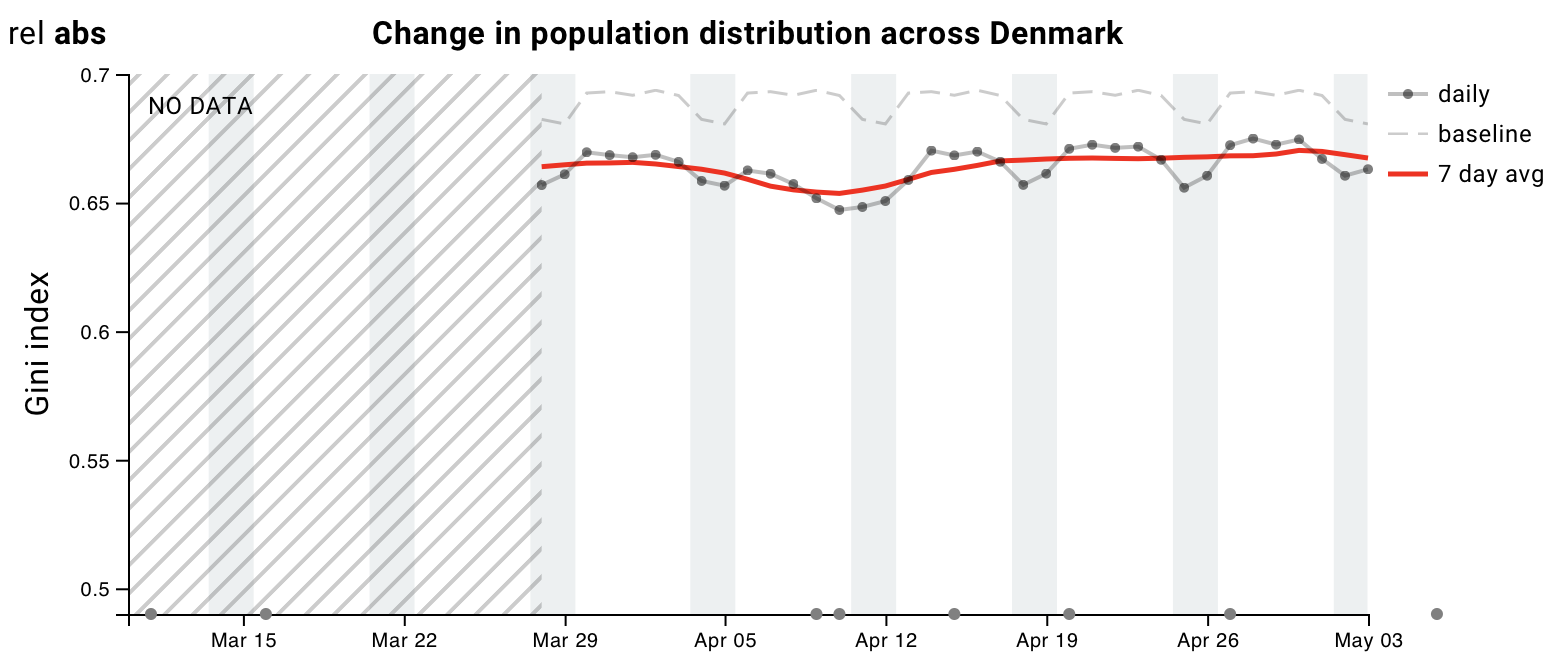
Absolute values of Gini Index
So the first (and trivial) thing to notice can be seen clearly in the figure below. Within the Capital region shown on the right, the population is very unevenly distributed (cf. the “mountains” in the image above), so the Gini Index is close to one. Instead, within Zealand shown on the left, the population is more spread out, and therefore the Gini coefficient is lower. In both plots we see a small upwards trend over time, indicating that the population concentration is increasing.
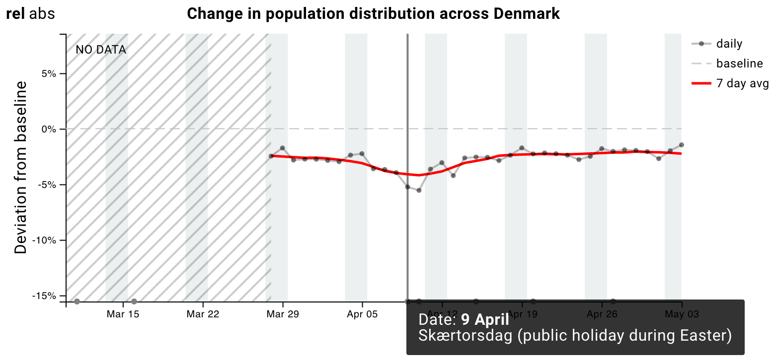
Relative changes of the Gini Index
By looking at the relative values of the Gini Index, we can see how much the current spread of population differs from what we would observe in “normal” times (specifically, we took the month before the lockdown as a reference). We can observe that, across Denmark, the concentration of the population has decreased by approximately 2%. The population was particularly spread out during Easter, when the Gini coefficient was 5% lower than usual. During April, the Gini coefficient has stayed approximately constant, suggesting that, when it comes to the overall spread of the population in Denmark, we do not yet see things going back to normal.