Population landscape
Post by Sune Lehmann. Visualization by Ulf Aslak. Published: May 14, 2020.
When you first get your hands on a new dataset, one of the key things to do is to look at the data. The human eye is expert at spotting patterns, systems, outliers. That’s one of the ways we form theories and hypotheses to explore with more complex statistical tools.
Sometimes looking at the data is as easy as plotting x against y. But other times the data is so complex that it is very difficult to visualize – but then when you do, the results can be extraordinarily beautiful. That’s the case in the population landscape visualization.
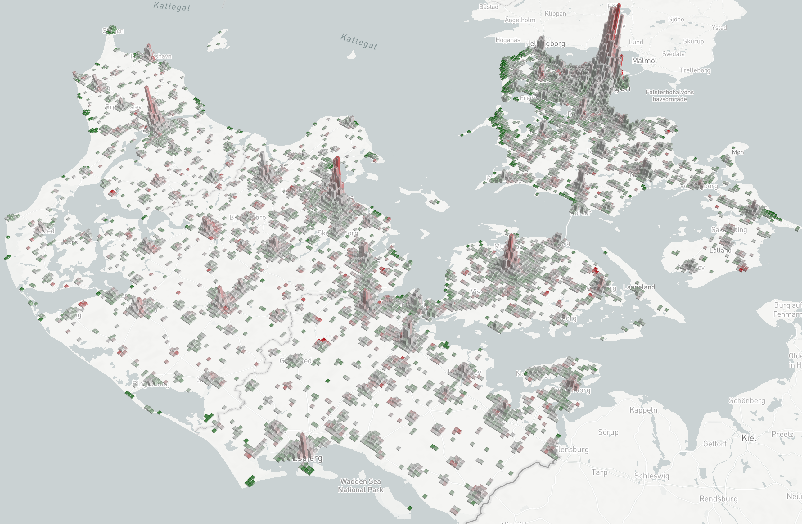
Here we are interested in understanding where on the map that people are spending their time. Furthermore, we want to understand how that changes over time. And we want to compare that to how they were behaving before the lockdown. Those three things in one visualization!
The result is the beautiful landscapes you see above and below.
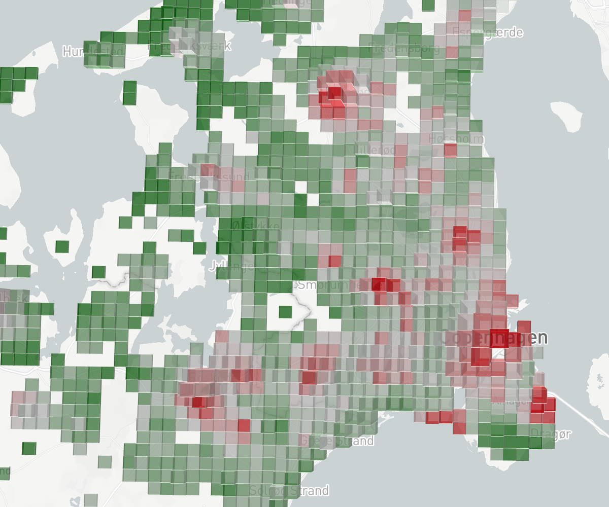
How to read the map
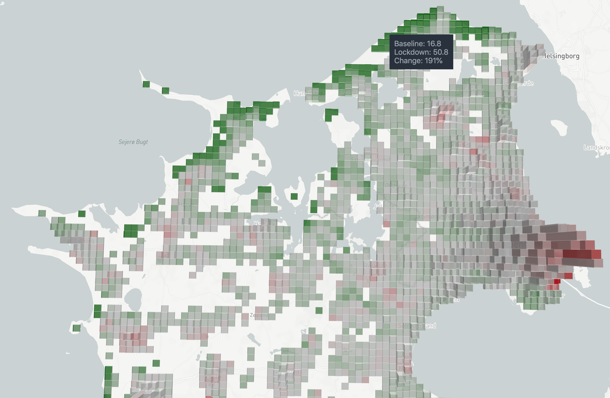
Let’s focus on the view of the entire country shown below. Here we plot tiles with a height that corresponds to their baseline—pre-lockdown—count (how many people are usually in this tile on this weekday in this time interval), and a color that corresponds to the percentage change from that baseline.
Maximally red tiles contain less than half of the people they usually contain (≤ –50% deviation from baseline). Maximally green tiles contain more than one and a half times their usual count (≥ 50% deviation from baseline).
Now you’re ready to go play with the visualization for yourself!
Visualization: Click here to inspect the data yourself. To change the map angle, hold shift or alt while panning. In the interactive view, you can also scroll across dates to study changes over time.
Below, we share some observations that we’ve made.
Country and region
Question: How does the overall population distribution change when people cease work or can work from anywhere?
Observation 1: Large parts of the population have left the cities. The data shown above is from Monday April 6, night (18–02), a time when people are normally at home. The tall red tiles in urban areas reveal that people who live there are not at home. The pattern is found throughout the lockdown. This effect was particularly striking over the Easter break in mid-April and decreased as schools reopened.
Observation 2: Holiday areas become densely populated. A closer look at ‘Region Hovedstaden’ reveals very high population counts near coastal areas known to contain holiday homes, in some tiles with more than a 100% increase compared to the baseline. As above – since there is a connection – this effect was particularly striking over the Easter break in mid-April and decreased as schools reopened.
Urban agglomeration
Question: How does the population distribution during work hours (18–02) around cities change when workers are sent home?
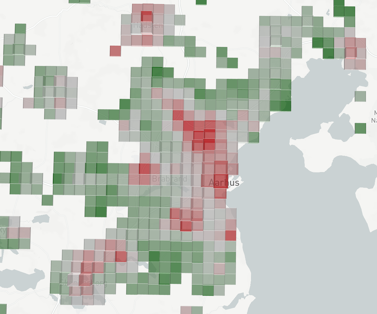
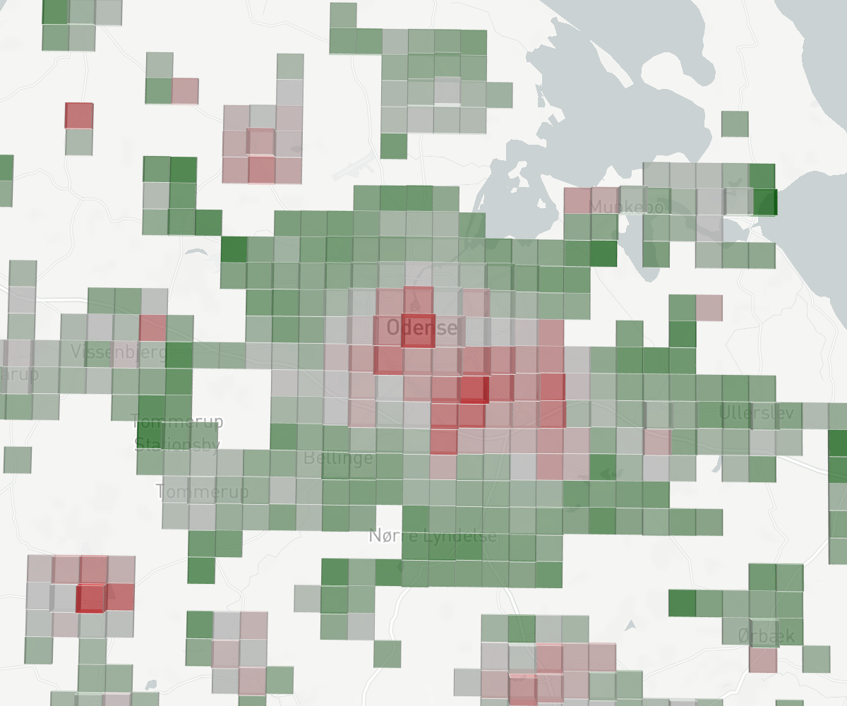
Observation 3: Places where people work (inner city, industrial areas, airports) become relatively empty during work hours. Places where people live (outskirts, rural areas) become more populated. In the figure above we visualize population counts around metropolitan areas for working hours (10–18). It is not surprising that we see places associated with work decline significantly in population during work hours, and conversely that places where people live boom; this is simply the effect of work moving into peoples homes.