Population landscape
Visualization and data analysis by Ulf Aslak and Peter Møllgaard.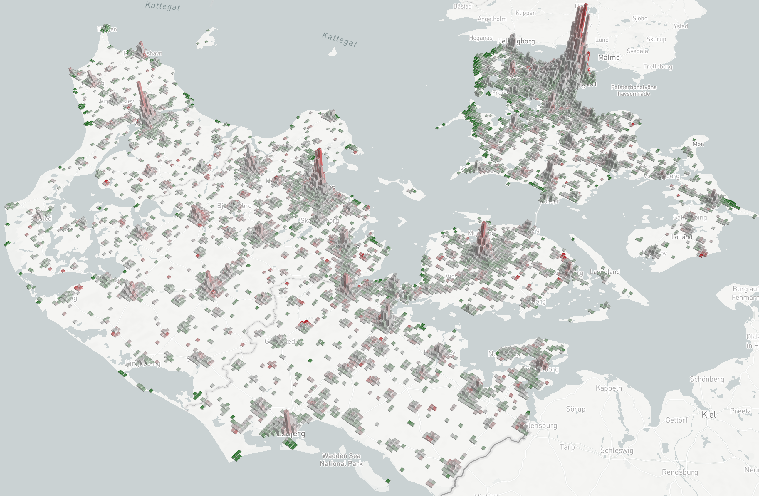
The population density maps describe the number of people in tiles (square areas) throughout the country at different time-intervals.
In the two figures below we plot tiles with a height that corresponds to their baseline—pre-lockdown—count (how many people are usually in this tile), and a color that corresponds to the percentage change from that baseline (how did the population in that tile change).
Maximally red tiles contain less than half of the people they usually contain (≤ –50% deviation from baseline). Maximally green tiles contain more than one and a half times their usual count (≥ 50% deviation from baseline).
Click here to inspect the data yourself. To change the map angle, hold shift or alt while panning.