What’s happening in my city?
Post by Laura Alessandretti. Published: May, 11, 2020.During the lockdown, people have moved across Denmark, fleeing from some areas and populating other parts of the country. By looking at the change in population sizes across cities, we can discover where the number of occupants has increased during the lock-down and vice versa, as well as how these changes evolved across March and April 2020. Here we discuss (some of) the conclusions that can be drawn by visualizing the data.
The number of occupants has increased in holiday destinations, and decreased in urban hubs.
Let’s look at the relative change in number of occupants with respect to February. In the figures below, extracted from the first interactive visualization, each black line displays the change in number of occupants for a single municipality. A horizontal dashed line indicates the baseline – where the curve of a municipality that experienced no decrease or increase in occupants compared to February would lie. As can be seen in the left-hand figure, a majority of black lines are above the dashed line corresponding to observing “no change”, revealing that in most cities the number of occupants has increased during the lockdown.
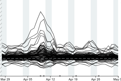
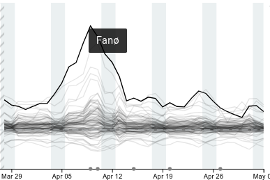
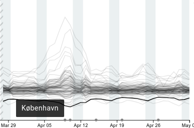
The center figure illustrates the useful interactive feature of the visualization. By hovering with the mouse over the line, we find that the cities experiencing the largest increase in population size correspond to holiday destinations. These destinations include Fanø, Odsherred, Dragør, Gribskov, Læsø, Halsnæs, where the population size has increased up to 20% as of May 3rd. Conversely, the right-hand figure shows that the cities experiencing the largest decrease correspond to the major urban hubs in Denmark: Copenhagen and surrounding municipalities (Fredriksberg, Ballerup, Lyngby), Aarhus, Odense, and Aalborg. In these areas the population has decreased by approximately 10% as of May 3rd. We clearly see that these changes were more pronounced during the Easter break (April 9th–13th), where holiday destinations increased in population up to 80% and urban hubs decreased by more than 15%.
Interestingly, the cities experiencing a decrease in population size include Tårnby and Billund. This is not surprising considering that’s where the major Danish airports are!. In addition to this, Billund, home of LEGO, could be suffering from LEGOLAND being temporarily closed during the lockdown.
Changes are not that dramatic.
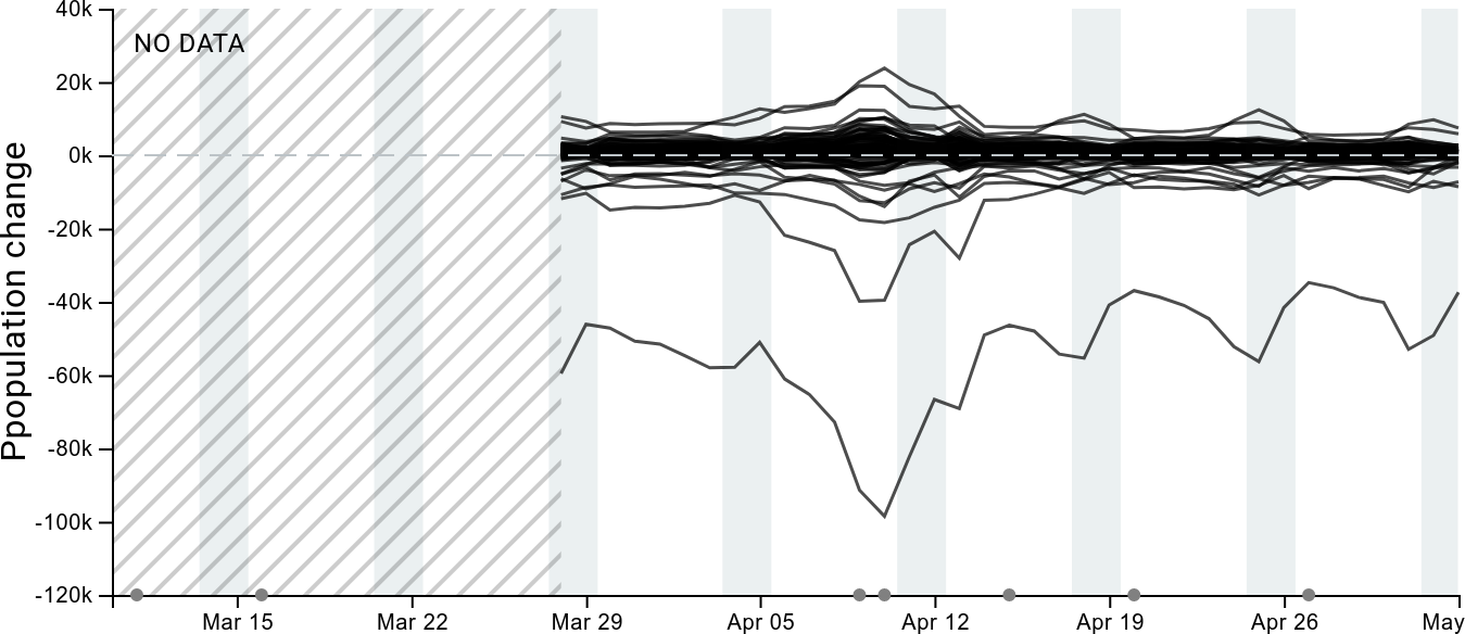
What do these relative changes actually mean? Let’s look at the absolute numbers. The figure below shows that the absolute change in population size is typically less than 20,000 individuals (this is true for all municipalities except Copenhagen). In fact, most lines are very close to the dashed line corresponding to “no change”, suggesting the actual change measured in terms of number of individuals is not that large. For example, in Fanø, which is a small island, even if the relative change is huge, there are only ~500 individuals more than usual. On the contrary, as of May 3rd there are approximately 40,000 less individuals staying in Copenhagen as compared to the February baseline. This huge difference is very likely to be a consequence of the border closure, as fewer tourists have visited the capital this spring.
Things are slowly moving back to normal.
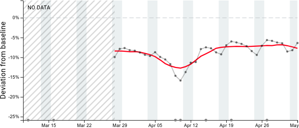
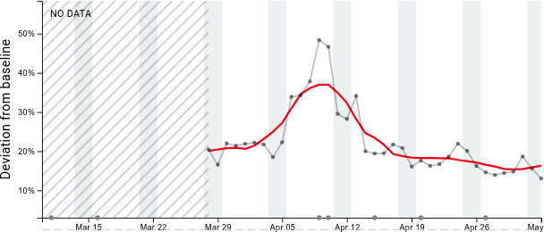
Let’s now zoom in into single municipalities and check how things are evolving over March and April by looking at the second interactive visualization. As is illustrated in the left-hand figure below, we can see that in Copenhagen the number of occupants is slowly increasing again, moving up by approximately 3%. Similarly Aarhus, Odense and Aalborg show an increasing trend. Conversely, the number of occupants in holiday destinations is slowly decreasing. For example, as is illustrated in the right-hand figure below, the number of occupants in Gribskov has decreased by approximately 5% in the period under study.
