Population density during lockdown
Report by Ulf Aslak, Laura Alessandretti, and Sune Lehmann. Updated: June, 2, 2020 8:10:17
An important aspect of understanding how the lockdown affects mobility is how the population is re-distributed across the country.
- Do people stay in their homes or do they move to less populated spaces?
- How is population density in the cities impacted?
- What is the development over time?
- Can we find signs of normality in the population distribution as the country opens up?
In this (continuously updated) report we will address these and related questions. Data for this report are so-called “Population density maps” and were provided by the Facebook’s Data for Good initiative; please see the section Data description at the bottom of this page for descriptive details, and notes on privacy and limitations.
Visualizing population distribution
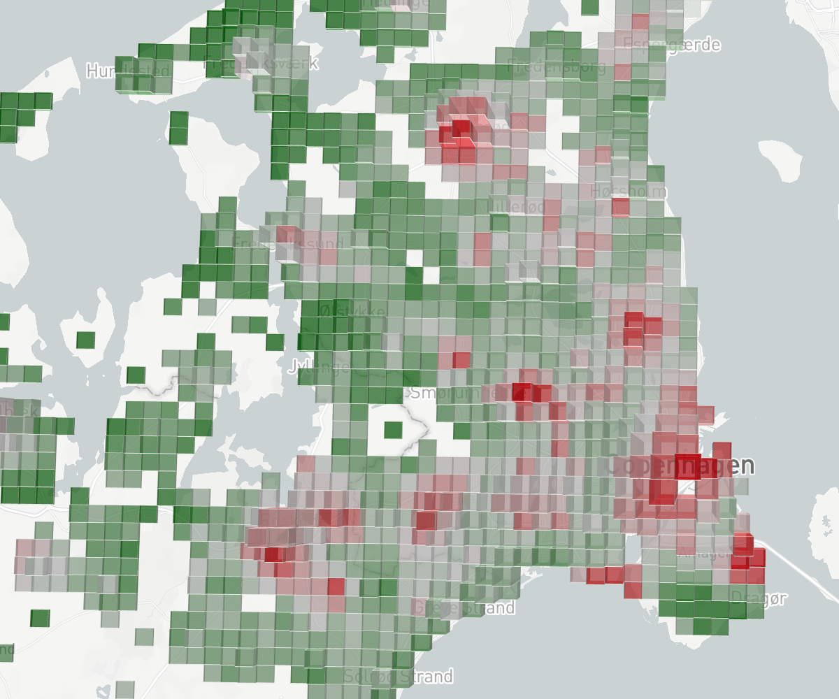
The population density maps describe the number of people in tiles (square areas) throughout the country at different time-intervals.
In the two figures below we plot tiles with a height that corresponds to their baseline—pre-lockdown—count (how many people are usually in this tile), and a color that corresponds to the percentage change from that baseline (how did the population in that tile change).
Maximally red tiles contain less than half of the people they usually contain (≤ –50% deviation from baseline). Maximally green tiles contain more than one and a half times their usual count (≥ 50% deviation from baseline).
Visualization: The following sections Country and region and Urban agglomeration highlight observations that can be made by exploring our interactive map visualization of the Population density maps. Click here to inspect the data yourself. To change the map angle, hold shift or alt while panning.
Country and region
Question: How does the overall population distribution change when people cease work or can work from anywhere?
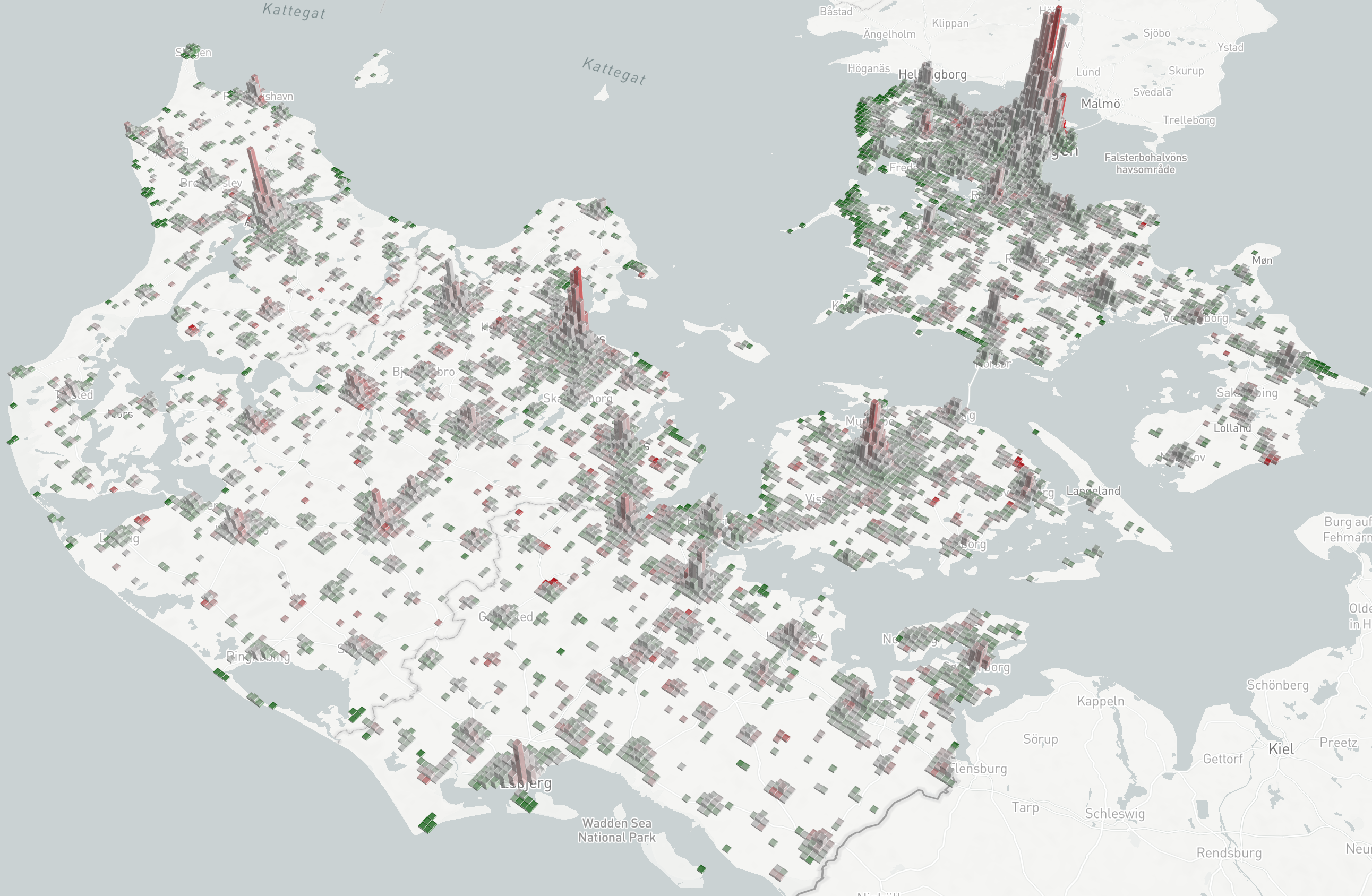
Observation 1: Large parts of the population have left the cities. The data shown above is from Monday April 6, night (18–02), a time when people are normally at home. The tall red tiles in urban areas reveal that people who live there are not at home. The pattern is found throughout the lockdown.
Observation 2: Holiday areas become densely populated. A closer look at ‘Region Hovedstaden’ reveals very high population counts near coastal areas known to contain holiday homes, in some tiles with over 100% deviation from baseline (read more about regional population change under Local population deviation below).
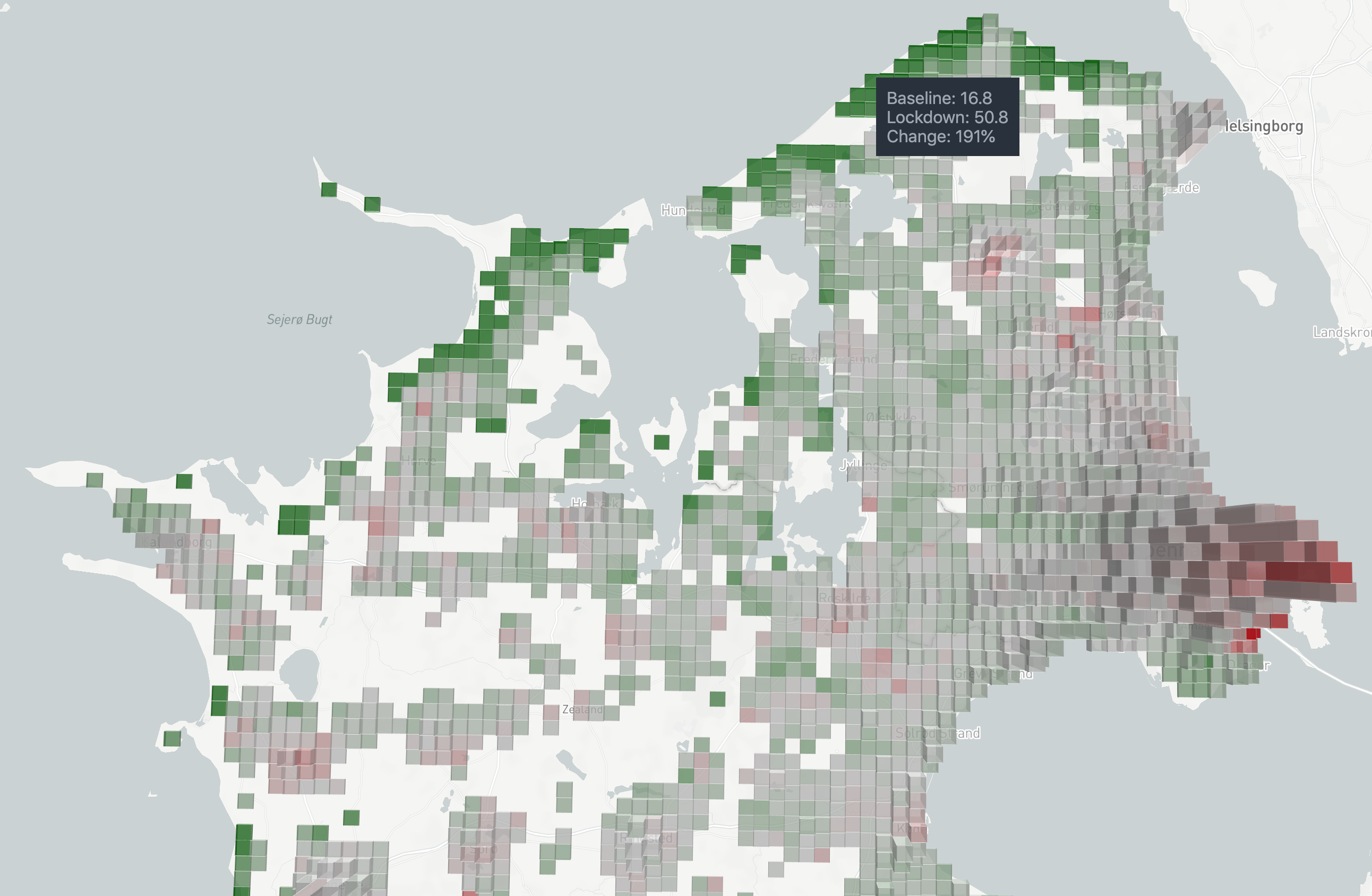
Urban agglomeration
Question: How does the population distribution during work hours (18–02) around cities change when workers are sent home?
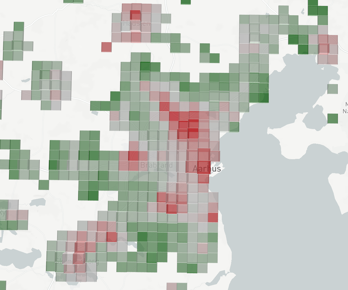
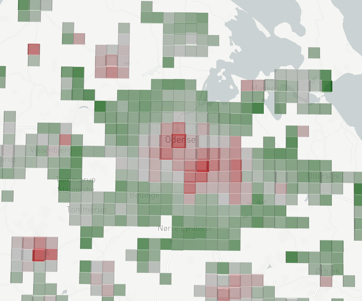
Observation 3: Places where people work (inner city, industrial areas, airports) become relatively empty during work hours. Places where people live (outskirts, rural areas) become more populated. In the figure above we visualize population counts around metropolitan areas for working hours (10–18). It is not surprising that we see places associated with work decline significantly in population during work hours, and reversely that places where people live boom; this is simply the effect of work moving into peoples homes.
Analyses
A key thing that we are interested in is changes over time. Below we look into various aspects that help us understand and quantify the changes we observe on the map.
Leaving home during the day
By looking at how the number of people spending most of their time in a given area changes between working hours (10–18) and non-working hours (18–02) we can assess how many individuals leave their home during the day (for example to go to work). We use the following reasoning: if 80 people spent most of their time in a given tile during working hours and the number is 100 during non-working hours (allowing us to assume that 100 people live there), we can say that 20 people were not at home during the working hours of the day. This is not a perfect measure, as work and home areas are not fully seperated, so the numbers we report are a lower bound, as some people will work very near home, or work where others live. The important to look for here is how the daily measurements deviate from the baseline.
Note that you can interact with the figure below. You can:
- Change the municipality displayed using the dropdown menu.
- Toggle whether the y-axis displays the absolute measurements (rel/abs) or the deviation from the baseline (rel/abs).
Observation 4: People are spending less time away from home during weekdays. This is an expected pattern (around -50%, toggle rel abs to inspect), and corroborates Observation 3.
Observation 5: People are more away from home on weekends, which is a trend that seems to increase over time. One plausible explanation for this is that the weather in Denmark has been exceptionally good during April motivating people to spend more time outside. At the same time, the baseline is based on data from January and February, where people tend to stay inside because of cold weather. Even so, however, the large increase in the most recent weekends [written: May 4] shows that people are going out on weekends more.
Observation 6: Date of child-care reopening is a changepoint. April 15 when daycare institutions, kindergardens and school for the youngest opened back up (at 50% capacity), the number of people leaving their home during working hours seems to rise above the trend seen previously in the lockdown. In the following weeks more people follow suit (though still around -35% reduction).
Local population deviation
We saw in the visualization of the Population density maps that there are places which attract people during the lockdown and others that drive them away (observations 1 and 2). We begin, therefore, by quantifying population count changes over time at the municipality level.
Question: How many people are there a given municipality, compared to pre-lockdown?
We first plot daily population change for all municipalities in the same figure. The figure lets you toggle whether the y-axis displays change relative to the average population size of each municipality (rel/abs), or not, i.e. the absolute population deviation (rel/abs). You can also change the time interval to display results for.
We also plot each municipality individually letting you select which one to display using the dropdown. Here toggling ‘rel/abs’ displays population size on the y-axis. For example, for Copenhagen (København) we see that the baseline population size is around 600k (the public count for 2017 is 602.581; source UN) whereas the lockdown population size is around 540k, which yields a relative change of around -10%.
Observation 7: Major country-wide population changes over Easter. Over Easter and in particularly Thursday which was a national holiday, we observe the largest fluctuations in population size. Municipalities which primarily contain urban and large suburban areas see a massive decline in population. The municipalities with the largest relative population decrease on Thursday April 9 are:
- Frederiksberg (-16.6%, -17.6k)
- København (-14.7%, -91.4k)
- Tårnby (-12.1%, -8.0k)
- Lyngby-Taarbæk (-12.0%, -5.3k)
- Aarhus (-11.2%, -40.0k).
Reversely, in municipalities which contain large portions of rural space there is an increase in population size on this date. Municipalities with largest relative increase are:
- Fanø (81.1%, 2.6k)
- Odsherred (62%, 20.0k)
- Gribskov (48.4%, 18.9k)
- Læsø (43.4%, 227)
- Halsnæs (39.2%, 12.4k).
While these changes level out after Easter, the above ranking more or less holds. For example, Gribskov municipality typically contains on average around 20% more people than usual (~15% during afternoon/night and ~30% during working hours). To what extent this occurs because people move into their summer houses, temporarily move in with relatives, or other is unclear from this analysis, but it is likely a mixture of different behaviors.
Overall it hints towards a population that is less concentrated in the cities and more evenly spread out across the country. In the section Spread out population we quantify this effect.
Observation 8: People are slowly returning to the cities. On April 6 we made Observation 1 that people were leaving the cities. Now [written: May 4] we observe that populations are slowly returning to the urban areas.
Assessing relocation
Any positive or negative deviation observed in tiles means someone is not where they usually are. By averaging the total amount of positive and negative deviation we can assess the share of people that—relative to the given timeframe—have relocated.
Question: How many people are not in their usual place?
Observation 9: 2–4% of the population has temporarily moved away from their home. The relocation we observe during afternoon and night (select 18–02) equates to the number of people that are not at home at night. Relocation peaks at 5% on Friday of Easter. We expect this to decrease to 0% when society has fully reopened, but at the current time [written: May 4] there does not appear to be a decrease compared to the earliest recorded week of lockdown.
Observation 10: 5-7% are displaced during working hours. Selecting the time window 10–18 we observe that people have relocated work to other places—like home—and are, therefore, not in their usual place–their workplace. For the reason mentioned under Leaving home during the day we can only take the values on the y-axis as a lower bound. But we do observe that a decreasing proportion of the population keeps away from work.
Spread out population
The Gini Index measures how unevenly distributed (or concentrated) a distribution is and can, therefore, inform us about trends in how the population spreads out across the country. As we can see from the giant peaks of cities in the Population density maps visualization (see Visualizing population distribution), the population is usually very unevenly distributed. We observe in the same map visualization that people spread out during the lockdown, distributing themselves more evenly throughout the country.
The Gini Index ranges from zero to one. If the population spreads out perfectly such that every tile contains the same number of people, the Gini Index will be zero. If all of Denmark concentrates in a single tile it will be one. In the figure below you can select different timeframes for different parts of the country.
Observation 11: Population concentration has decreased by 6-1%. This is in terms of the Gini index. This concentration decrease (or “spreading out”) peaks over Easter which supports our observations above.
Observation 12: Population concentration is slowly increasing. On week 14 during weekdays (March 30–April 3) the average deviation from baseline was -2.8%. By week 18 the weekday average deviation from baseline was -2.1%.
Data description
Data was made available through Facebook’s Data for Good initiative. The earliest data made available starts March 28; at the lowest level it details population counts in geographical tiles up to 1.5 km by 1.5 km in size in three timebines each day (0–8, 8–16, and 16–24 GMT). Aggregation at the municipality level is also available. For privacy preservation, data is unavailale in tiles/municipalties where at a given time < 10 people are present. For each count a corresponding baseline value is provided. The baseline is the average count for the same day and time over the 45 days prior to data generation. There are two important things to note about this data:
- Since the baseline averages over the 45 days prior to data generation, and data generation starts on March 28, around two weeks of the 45 baseline days span into the lockdown period. Therefore, by comparing to this baseline reported effects may be as much as 33% smaller than those we might have obtained if comparing to a baseline that did not include lockdown.
- In any given time interval, the total number of counted individuals across the whole country is between 324.188 and 466.815 (mean: 421.500; median: 448.929; lowest between 0–8 GMT). These are Facebook users that actively use the mobile app at some time during an interval. To offer realistic population counts in the interactive visualization, we factor into the raw user counts the ratio between the total number of people in Denmark (5.787.997, as of Thursday, April 16, 202; source: Worldometer) and the number of active users in a given time interval. This ratio varies between 13.8 and 17.9. Note, however, that the percentage change is computed after factoring in this ratio. This recalibration assumes that active Facebook users are distributed evenly throughout the population.
Update log:
17.4.2020: The ratio between the total Danish population and the number of active Facebook users in a given time interval is now factored into the counts we display in the interactive population density map visualization. The percent change displayed is calculated from the recalibrated values. Affected text in Data description has been updated.
17.4.2020: Sentence “There are two important limitations in this data” changed to “There are two important things to note about this data”.
17.4.2020: Change recommendation from using alt for rotating view in interactive visualization to using shift. Both keys, however, work in most browsers.
18.4.2020: Add button in visualization to change colorscheme. Rotates between five different schemes.
18.4.2020: Add options to display y-axes as absolute. When absolute, it expresses approximate number of individuals. The ratio between the total Danish population and active users within the time window is factored into counts, same as in the visualization.
18.4.2020: Add option in dropdown of “Change in population size” plot to display all municipalities at the same time.
20.4.2020: Small improvements to text.
3.5.2020: Add section “Leaving home during the day”.
4.5.2020: Update all figures to display rolling 7-day average, legend, events and shade for period with no data.
4.5.2020: Remove option to display 02–08 timeframe in all figures, as it is non-informative and only adds confusion.
4.5.2020: Reformat text to explicitly state what our observations based on the figures are.