Movement Maps
For understanding How people move we use so-called “Movement Maps”, which are provided by the Facebook’s Data for Good initiative. Specifically, we use a combination of Movement maps at tile level and administrative region level (see Granularity and Further preprocessing).
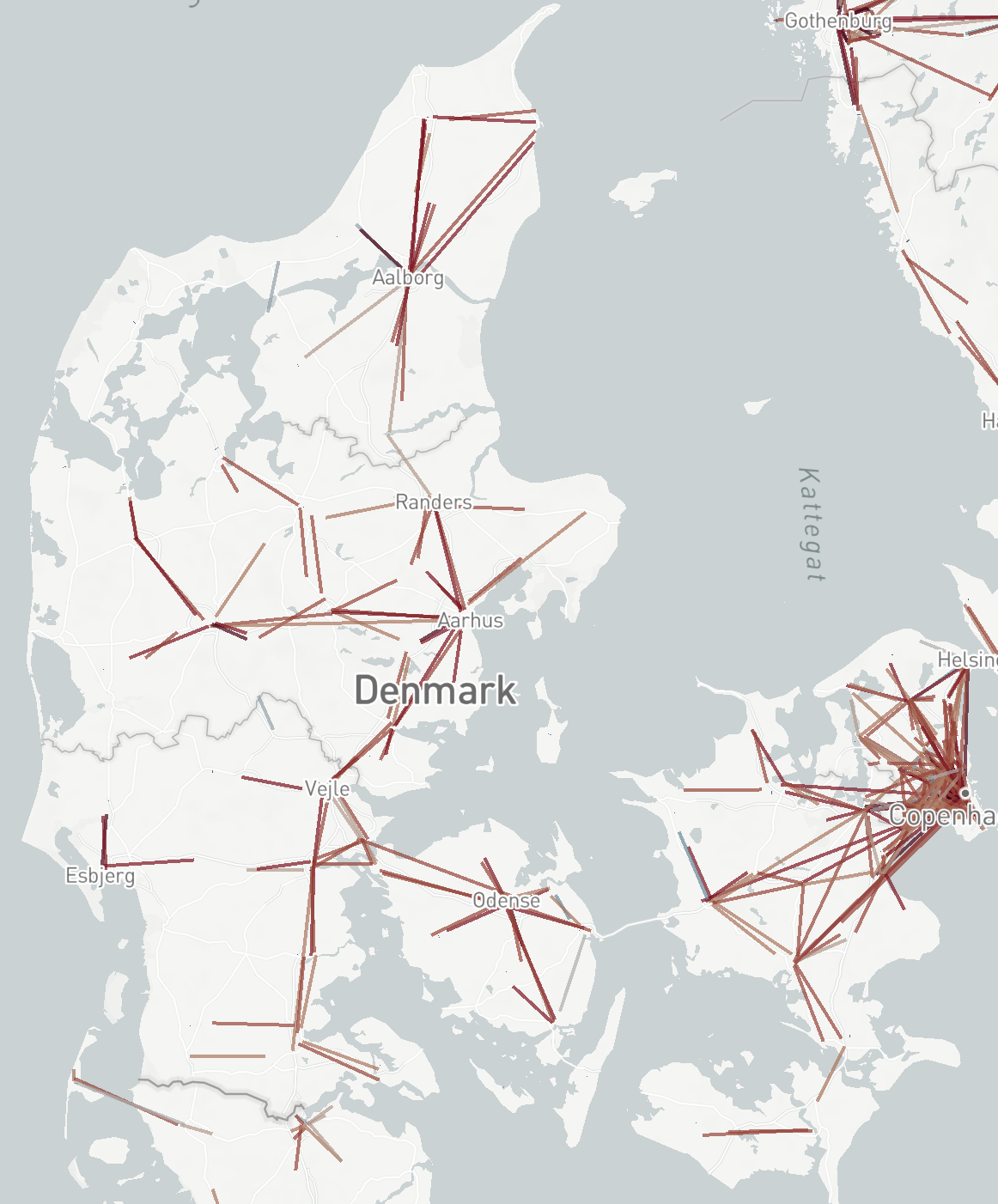
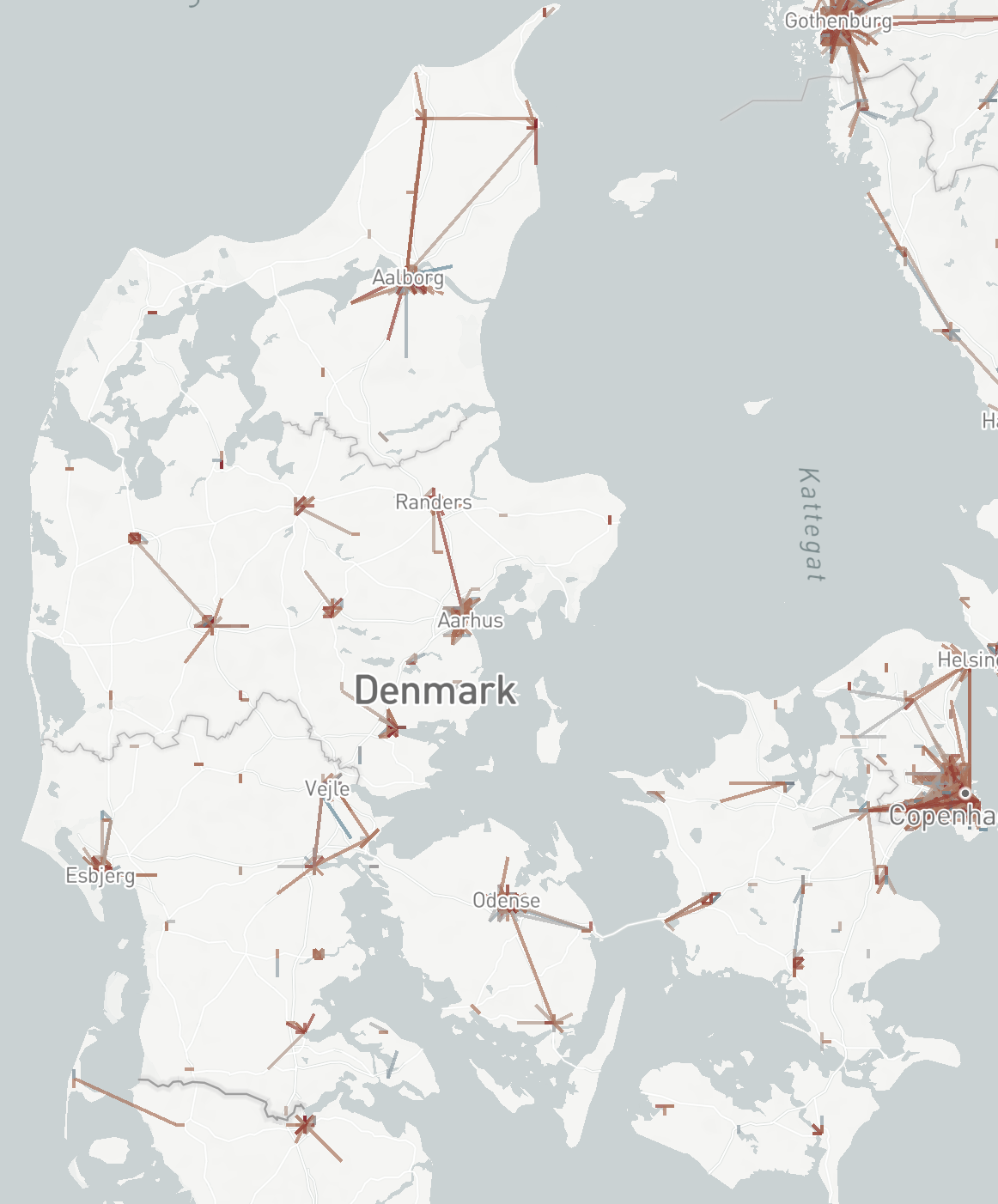
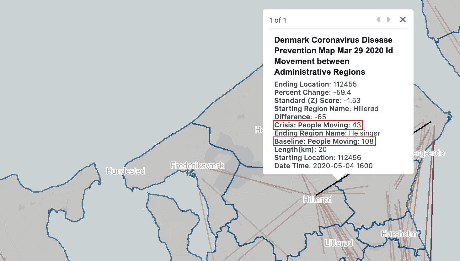
Description: A Movement map seperates the country into different areas. It then reports the number of users that travel between areas, for three eight hour time windows each day. Specifically, a movement count between two regions, for a given time window, represents the number of people that, in the previous time window, spent most of their time in one region and in this time window spent most of their time on the other region. For example, for the 18-02 time window (night hours) on May 4, we may observe 43 active Facebook users moving between Hillerød and Helsingør municipalities. This means that 43 people spent most of their time during the 10–18 time window inside on of these municipalities, and then during 18–02 time window spent most of their time in the other one. Non-movement is recorded in the same way, that is for each region Facebook also counts the number of users that do not move. Because data is aggregated like this, there is no information left to identify individuals and privacy is thus preserved (see Privacy and data loss below).
Time: The earliest data made for available for a country typically starts shortly before the lockdowns or shortly after. For the UK, Spain, Italy, New Zealand and France data collection starts before their respective lockdown periods begin, and for the remaining countries data collections starts after. For each country, we receive new data with ~1.5 days delay. For each day, three data files are provided; one for each of the time windows 0–8, 8–16, and 16–24 GMT. In Denmark, for example, from March 29 to October 25 (DST), time windows in local time are 02–10, 10–18 and 18–02.
Granularity: Movement maps are delivered at two levels of granularity. Level (1) describes movement counts at the lowest administrative level, which for Denmark is municipalities. Level (2) describes movement counts between geographical tiles up to 3 km by 3 km in size. Note that this is twice the width and length (four times the area) of tiles in the Population density maps. The administrative level maps are aggregates of the tile level maps, but they differ in a systematic way due to privacy preservation (see Privacy and data loss below).
Baseline: For each movement count (whether it is for a tile or an administrative region) a corresponding baseline count is provided. The baseline is the average count for the same day of the week and time window over the 45 days prior to data generation. It is important to note, that since data generation starts at different times, and for many countries after their lockdown begins, a baseline measure may be polluted by data from the lockdown period. Therefore, by comparing to this baseline reported effects may smaller than those we might have obtained if comparing to baselines that did not include lockdown.
Crisis and baseline movement counts between Hillerød and Helsingør municipalities
Further preprocessing: In any given time interval, there is some number of movement and non-movement events rcorded. For example, for Denmark this is between 327k and 430k (mean: 360k; median: 353k; typically lowest between 0–8 GMT). There is one movement or non-movement recorded for each Facebook user with location tracking enabled that actively use the Facebook mobile app at some time during two adjacent time-intervals (like being active both in the 08–16 interval and the 16–00 interval). One reason why there are fewer mobility events than population counts it that it is not guaranteed that location for a user can be recorded in both time intervals. Another reason is due to privacy preservation (see Privacy and data loss). To offer realistic population counts, we factor into these mobility counts the ratio between the total number of people in a country (source: Worldometer) and the number of mobility and non-mobility events in a given time interval. This ratio—the inverse fraction of active Facebook users for a country in a given time interval—typically varies between 13.5 and 17.7, depenent on country and time. Although Facebook provides precomputed percentage change values between baseline and crisis, the percentage changes we report are computed after factoring in this ratio, seperately for crisis and baseline. This recalibration assumes that active Facebook users are distributed evenly throughout the space and population of a country.
To base our analysis on as much data as possible, we combine tile level and administrative region level maps. As described in Privacy and data loss below, a significant proportion of mobility events, especially long range ones, in the tile level maps are made unavailable because they are too rare (to lower risk of individual reidentification). At the same time, administrative level maps do not distinguish between movements and non-movements within administrative regions. We, therefore, discard movements between administrative region from the tile level data, and discard movements within administrative region from the administrative region level data, and combine these into one datasets.
Privacy and data loss: Mobility counts are made unavailale between tiles/municipalties at times when they occur less than 10 times. This causes a systematic underreporting of mobility from rural areas where there is a lower density of people and more possible destinations to move between. This is especially a problem in the tile-level maps. For this reason, long-range trips are often lost in tile-level maps. The average data loss in tile level mobility maps compared to administrative region level mobility maps is e.g. 92% (±8%) for Denmark, and loss is greater in rural than in urban regions of the country.